The rallies looked stretched on thin to medium volume accumulation. But if you look at the S&P 500 (10yr) and use the chart as example we can see how much liquidity can change markets and how the yield can also be sen as a indicator of stock trends; on the 5th October 2007 when the yield was at 3.78% the S&P 500 closed at 1,557.50 that was it's 10 yr peak, then as we all know the Fed cut rates and drove the yield down into 0% territory, on December the 2nd 2008 the yield was sitting below 0.01%, this yield remained when the index topped 1,205.90 (21st April 2010) it still remains at 0.01% with the current (26th July 2010) S&P 500 close at 1115.00. But, the S&P500 is still at 5yr lows compared to the 28th June 2005 close at 1201.50 when the yield was at 2.20%.
ref: Dynamic Yield Curve relative to S&P 500
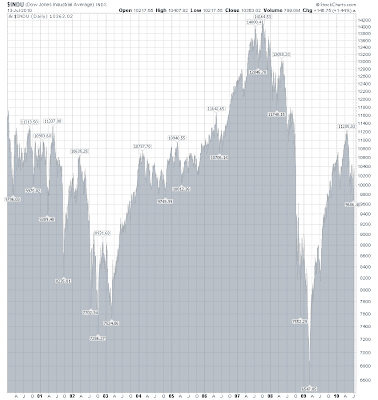
The 10yr Dow chart (below) is self explanatory no new highs in the last 10yrs (apart from the 2008 price spike - before the bust) liquidity inflows or not:

The point? The deflationary argument may reiterate a strong tune in favour of deflationary forces on stocks prices, when liquidity still hasn't managed to propel stocks into 10 yr +highs. Also indicates that liquidity may not entirely move into the stocks, rather liquidity ended up supporting the broken balance sheets of the WHOLE global banking system.
No comments:
Post a Comment